mirror of
https://github.com/webstudio-is/webstudio.git
synced 2026-11-08 21:15:18 +09:00
 Oleg Isonen
0c9e96d2e3
## Description

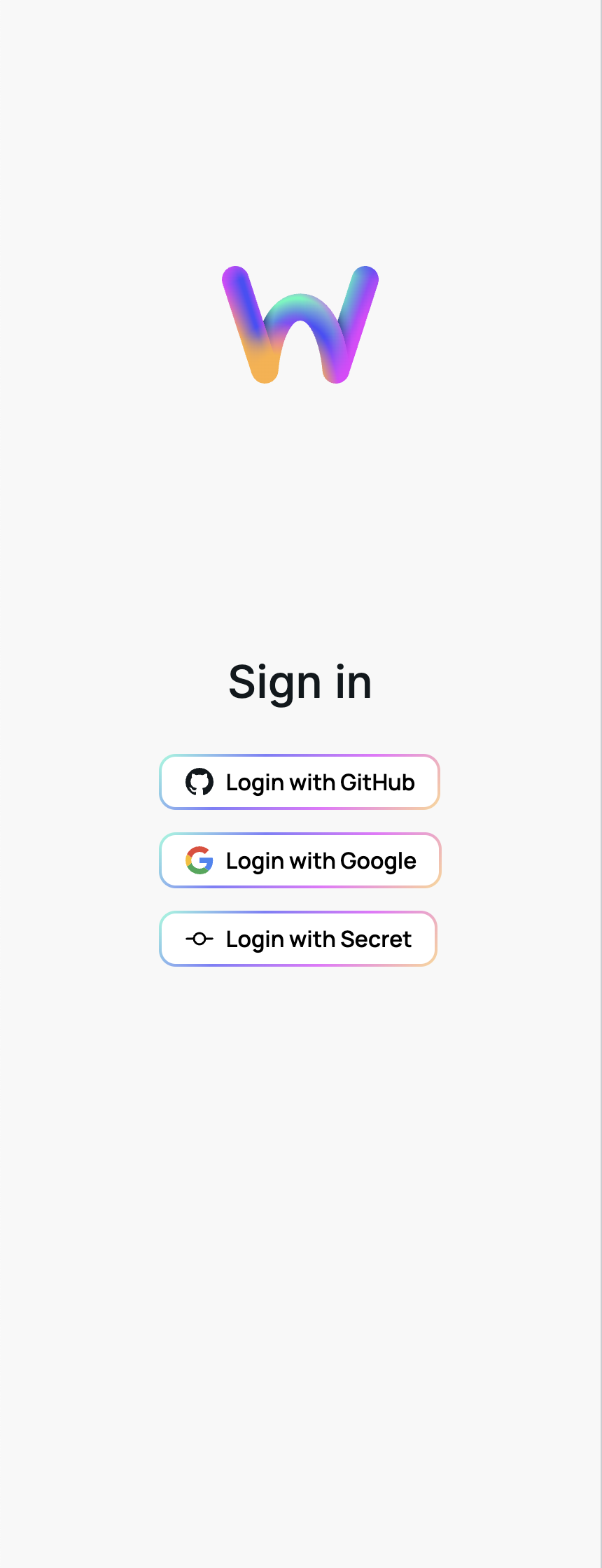
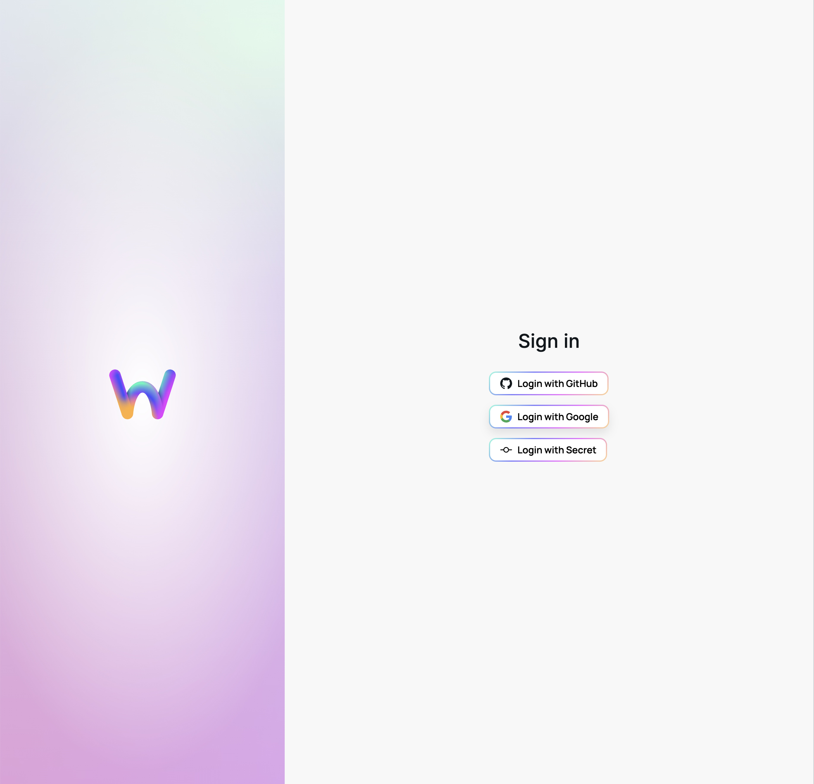
Login redesign

<img width="430" alt="Screenshot 2023-03-10 at 19 41 51"
src="https://user-images.githubusercontent.com/52824/224399146-74ee67f4-db60-4c1e-9582-f39f84498e8a.png">
<img width="1371" alt="Screenshot 2023-03-10 at 19 42 01"
src="https://user-images.githubusercontent.com/52824/224399154-3e7db67a-0149-4b86-8f12-9661395ae1b9.png">


## Steps for reproduction

1. go to /login


## Code Review

- [ ] hi @rpominov , I need you to do
  - conceptual review (architecture, feature-correctness)
  - detailed review (read every line)
  - test it on preview

## Before requesting a review

- [ ] made a self-review
- [ ] added inline comments where things may be not obvious (the "why",
not "what")

## Before merging

- [ ] tested locally and on preview environment (preview dev login:
5de6)
- [ ] updated [test
cases](https://github.com/webstudio-is/webstudio-builder/blob/main/apps/builder/docs/test-cases.md)
document
- [ ] added tests
- [ ] if any new env variables are added, added them to `.env.example`
and the `builder/env-check.js` if mandatory
55 lines
1.4 KiB
TypeScript
55 lines
1.4 KiB
TypeScript
import { css, textVariants, theme } from "@webstudio-is/design-system";
|
|
import type { ComponentProps } from "react";
|
|
|
|
const buttonStyle = css({
|
|
all: "unset",
|
|
boxSizing: "border-box",
|
|
minWidth: 0,
|
|
display: "inline-flex",
|
|
alignItems: "center",
|
|
justifyContent: "center",
|
|
gap: theme.spacing[5],
|
|
height: theme.spacing[15],
|
|
px: theme.spacing[9],
|
|
borderRadius: 12,
|
|
border: "2px solid transparent",
|
|
whiteSpace: "nowrap",
|
|
backgroundImage: `
|
|
linear-gradient(${theme.colors.backgroundPanel}, ${theme.colors.backgroundPanel}),
|
|
${theme.colors.brandBorderFullGradient}
|
|
`,
|
|
backgroundOrigin: "border-box",
|
|
backgroundClip: "padding-box, border-box",
|
|
color: theme.colors.foregroundMain,
|
|
boxShadow: theme.shadows.brandElevationSmall,
|
|
...textVariants.brandButtonRegular,
|
|
"&:hover": {
|
|
boxShadow: theme.shadows.brandElevationBig,
|
|
},
|
|
"&:focus-visible": {
|
|
outline: `2px solid ${theme.colors.borderFocus}`,
|
|
outlineOffset: 1,
|
|
},
|
|
"&:disabled": {
|
|
boxShadow: "none",
|
|
color: theme.colors.foregroundDisabled,
|
|
borderColor: theme.colors.borderMain,
|
|
"& svg": {
|
|
opacity: "0.5",
|
|
},
|
|
},
|
|
});
|
|
|
|
type BrandButtonProps = ComponentProps<"button"> & {
|
|
icon: JSX.Element;
|
|
};
|
|
|
|
export const BrandButton = ({ icon, children, ...props }: BrandButtonProps) => {
|
|
return (
|
|
<button {...props} type="submit" className={buttonStyle()}>
|
|
{icon}
|
|
{children}
|
|
</button>
|
|
);
|
|
};
|